UCLA Yanai Initiative - Website Design + Development
Celebrating Japanese humanities with a website that bridges East and West
Introduction
While the world outside enjoys an ever-expanding love of all things Japanese, the birthrate in Japan continues to decline, and, naturally, the transmission of Japanese culture and customs hangs in the balance.
As universities across Japan admit more and more international students, their humanities departments increasingly rely on English language courses to cater to students who arrive without sufficient spoken or written Japanese to truly learn in the country’s native tongue.
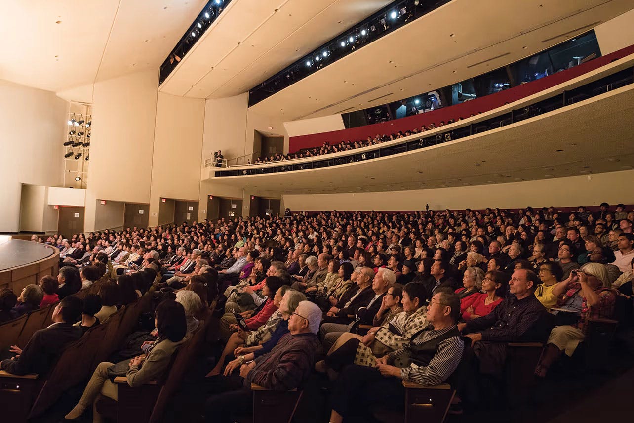
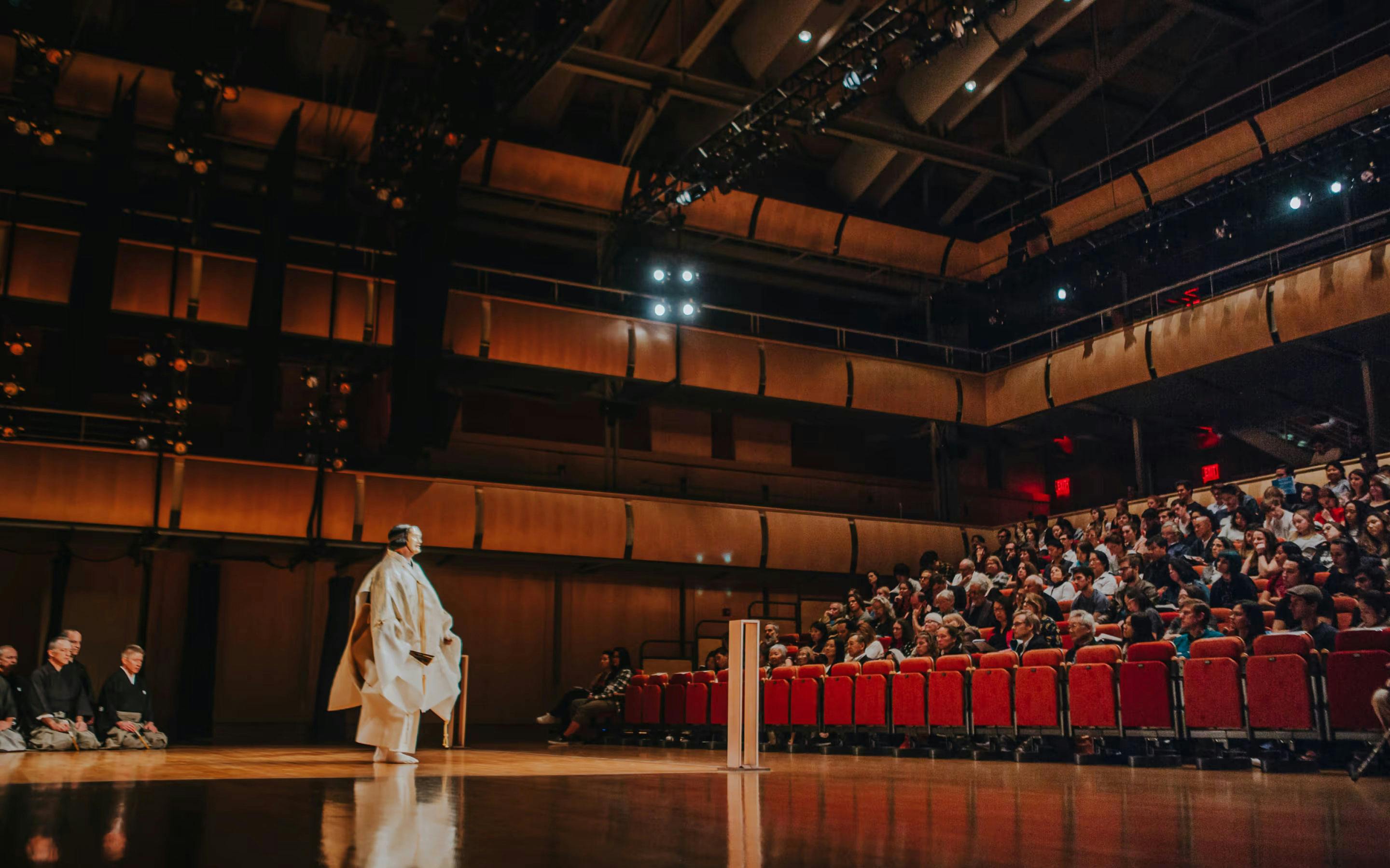
The Yanai Initiative is a partnership between Waseda University in Tokyo and UCLA that aims to preserve Japanese humanities for future generations. The partnership creates space, events and programs that evolve the exchange between Japan, the US and the world-at-large, opening doors for scholars to share and evolve their expertise through collaboration, lectures and more.
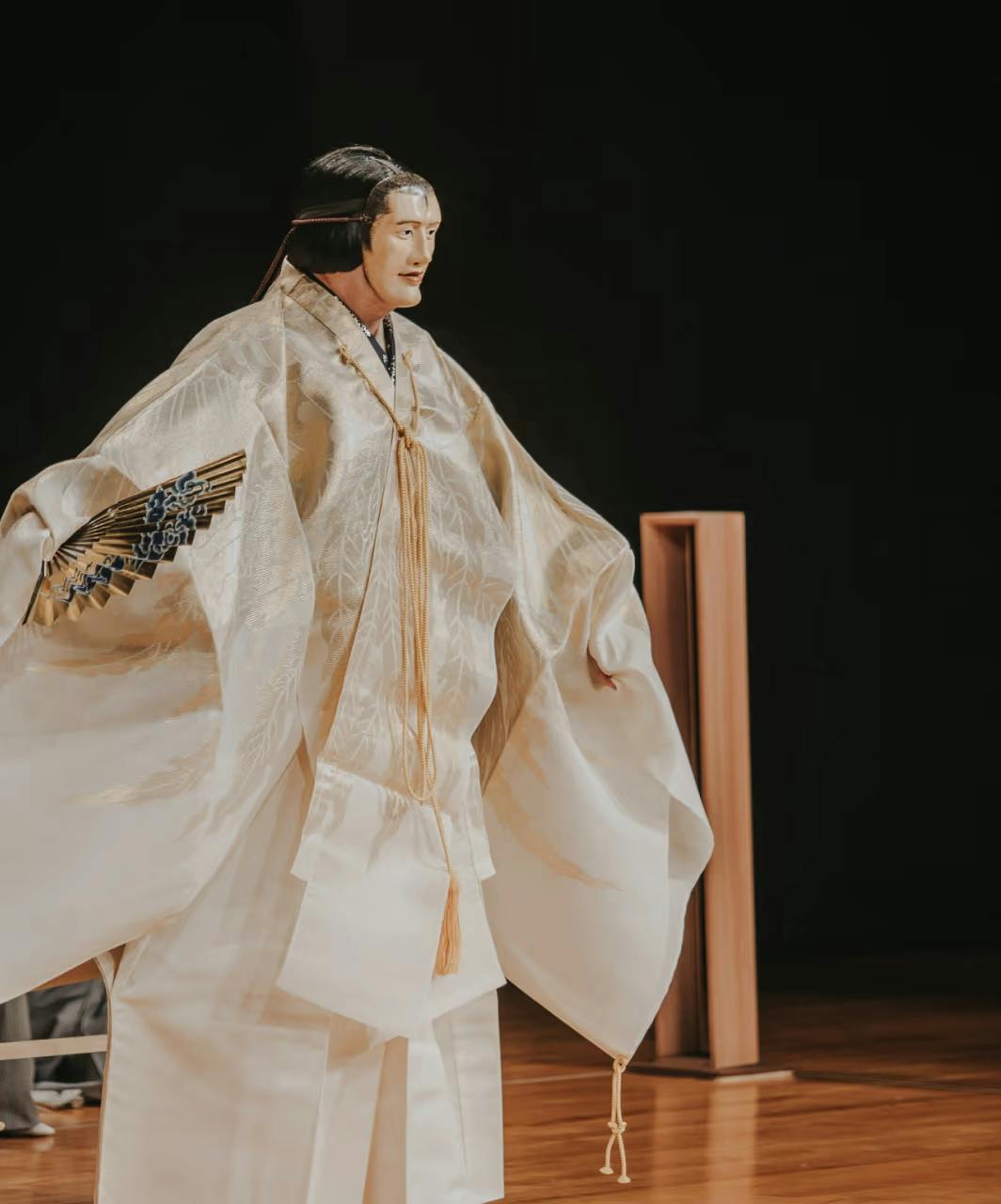
Yanai is a way of ensuring that those with transgenerational knowledge of Japanese culture are given avenues to share and cultivate that knowledge, successfully passing tradition and the zeitgeist of the present moment on to both American students and Japanese students whose access to deeper humanities learnings has diminished over the past generation or so.
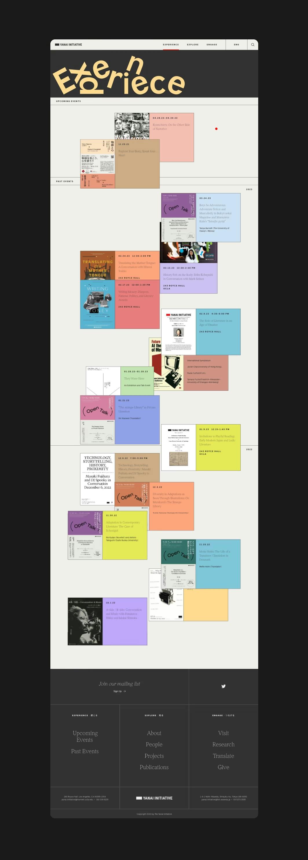
The Ask
The team at The Yanai Initiative approached us with a website that had long-since ceased in satisfying their core needs. At the beginning, they had a CMS that made it difficult to perform the regular functions they required, their design was dated, and most importantly, they were missing an opportunity to draw attention to their initiative in a moment when the world was more apt to engage than ever before.
The new site would not only need to host a vast collection of visual, written and experiential content, but it would need to actually deepen a user’s ability to interact with the broader context and meaning of these pieces and experiences by bringing them to life on the screen.
From the jump, it was clear that we were going to be able to create something visually stunning and uncommonly cool from a UX standpoint, and the fact that the Yanai team was hoping for a bilingual site afforded us the opportunity to think outside of the organic letterforms and shapes of the English alphabet.

The Action
Our teams worked to align and set the stage for early design explorations. After stakeholder interviews and a quick discovery round, we set to work auditing content and fleshing out a number of approaches to the visual language of the site. We proposed themes deriving from many elements and aspects of Japanese culture to probe for the right fit. Through many iterative rounds and explorations, we collaborated to pin down a theme capable of carrying the Initiative’s meaning throughout the entire site.
Flipping back through the Figma boneyard for this project reminded us of the many, many expressions that went into finally creating exactly what the Yanai team was looking for. It also made us feel so, so proud of the true passion our designers had for this project, and of our collaboration with the Yanai team when it came to translating a complex vision into a usable reality.
With a theme collaboratively dialed in, design began to happen quickly, so we paired design and development to begin the process of putting the vision into action.
When the design work itself is so exciting, we know that our developers are in for a major challenge. It’s exceedingly difficult to transpose visual design this nuanced and elegant into code, especially remotely, and it’s an area where we believe we shine. We’re proponents of fluency and curiosity that crosses department lines, and this site would not have been possible without a development team that loves and honors design—and vice versa.
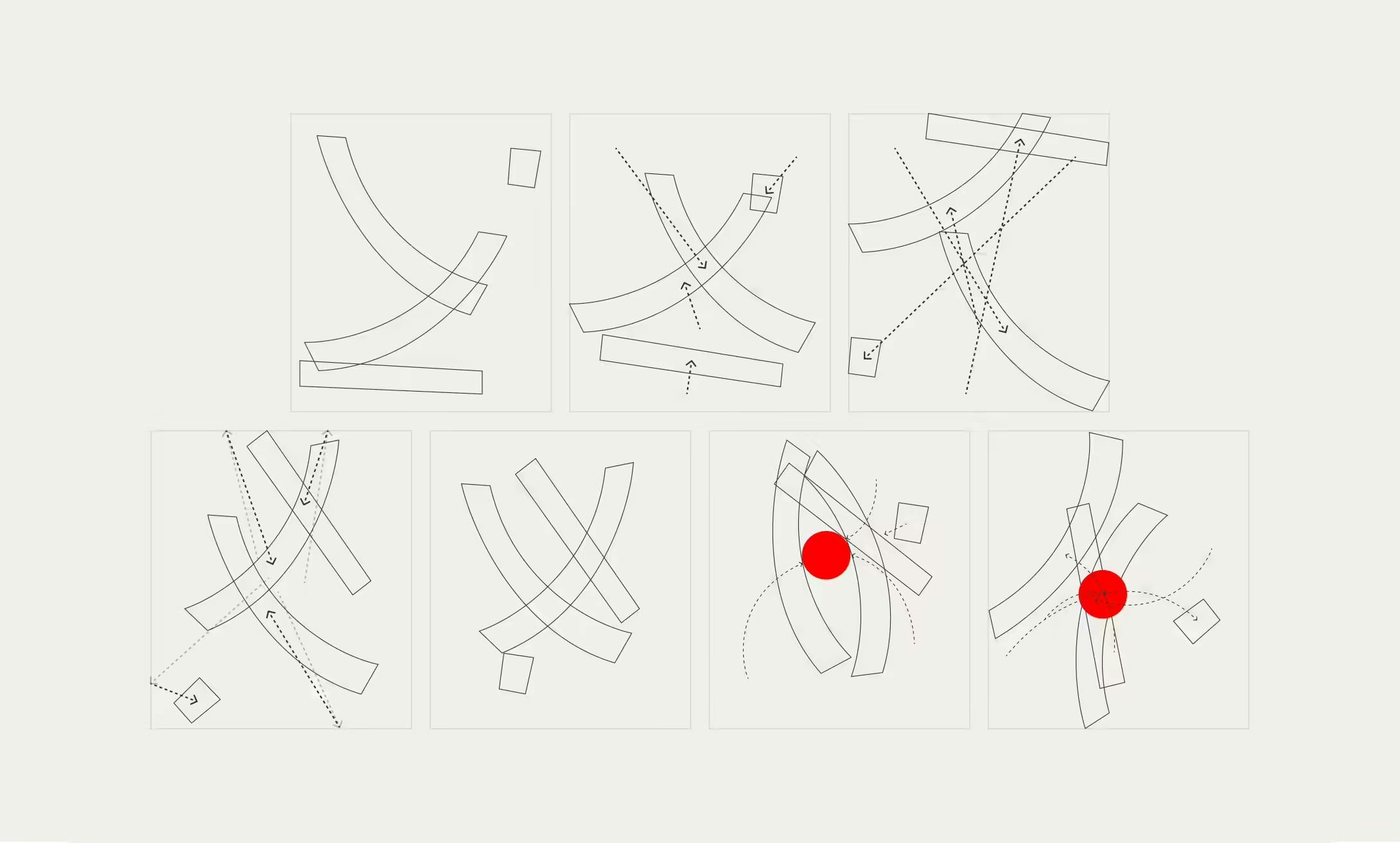
Code as art: our developers drafted storyboards to translate nuanced design to elegant code for the hero graphic of the Yanai homepage.
The Result
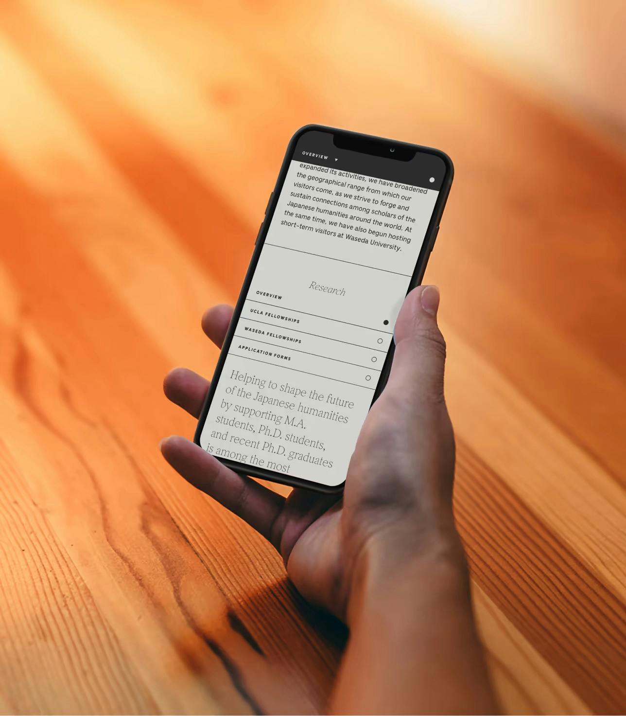
The resulting site draws clear influence from Japanese printed matter: catalogs, novels, newspapers, posters and daybooks, with their intricate use of faint and delicate lines to delineate sections. The beauty of interacting with two languages in harmony as you hover and flit throughout the site results in a stunning and transcendent effect.
In the case of The Yanai Initiative, the site really speaks for itself. It’s one of those engagements that you want everyone in your network, extended family or otherwise to see. One that makes you marvel at what your team can dream up and make real.
Together with our partners at Yanai, we crossed a huge number of difficult challenges off of our list, one by one. From content, translation, interactivity of archival materials, hoverstates and motion, all of the thought and careful consideration that went into this site can be felt as a user engages with it.
Features and visual flourishes that feel simultaneously whimsical and meaningful abound across the entire website: from the way cards flip over to the way that the H1s on each page float and bounce off of one another in an endless gentle loop, to the color palette that feels completely harmonious while seemingly comprising hundreds of hues.
Dreaming up and launching an experience that inherently excites both Japanese and English-speaking users is a pretty tall task, but that was a part of the vision from day one. As opposed to creating a site that felt bilingual as a matter of function or necessity, we worked with the Yanai team to build a site that was born from and referential of this cross-pollination.
With great challenges come great rewards, and both the Yanai and Use All Five teams are so pleased with the result of our collaboration. This was by no means the simplest way to approach The Yanai Initiative’s new website, but it was the right way, and the work paid off. Go visit; we think you’ll agree.
