Google Pay - Ecosystem Website Design + Development
Translating the complex payments universe behind Google's checkout magic
Starting with Google Pay: A Design Collaboration Story
As frequent collaborators with the world’s most visible technology brand, we’re attuned to the nuanced interconnectedness that makes them the most relied on provider of information on the planet. Any time something is innovative, simple and intuitive for the consumer, there’s immense complexity behind it, and the world of Google Pay is a prime example.
More often than not, we work with Google on special projects, experimental creative concepts and human interest pieces, or on the Google News Initiative, which ensures a future of truth in journalism.
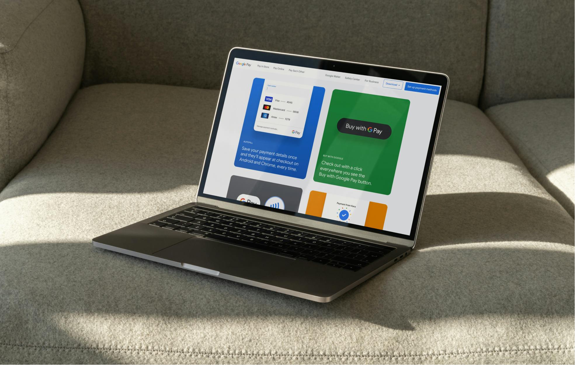
This time around, we were tapped to strategize, message, design and develop the websites of their super prominent, consumer-facing payments ecosystem.
Given that over the course of our 16 years, we’ve helped create and launch 11 (plus) incredible special projects with Google—ranging from native music production experiences to interactive hubs for trending civil liberties issues—we were thrilled when the payments team at Google approached us. We’d been recommended because of our stellar reputation as a collaborator who’s good under pressure, pushes when it’s right to and executes at an extremely high level. The Google payments ecosystem was our opportunity to continue to provide that level of partnership.
From the outset, the connectivity between Google Wallet and Google Pay required a lot of clarification. It’s funny when the convenience, security and obvious positives of a piece of technology are so easy to see and feel in practice, but so hard to explain accurately and simply with visuals and words.
Google's Challenge to Us: Simplifying Pay for the Next Generation
We were initially brought in to work on the Google Pay ecosystem over two and a half years ago and have been immersed in it ever since.
Our directive was simple from the jump: simplify the features and functionalities of this ecosystem in the eyes of the user, and elevate the overall perception of Google Pay and the ways it can increase opportunity and joy for anyone, anywhere. But on a deeper level, we were at work ensuring that we were creating two websites that were accessible, primed to SEO well and created to drive user engagement.
As is the case with Google, management is layered and many stakeholders need to weigh in before anything can go live. This is a part of the process that we’re well-versed in and excited to partner with Google on across all of our engagements. We know heavy organizations are interrelated and many projects are contingent on other projects. So, the ask always includes availability, flexibility, leadership and accountability, which we’re proud to provide.
The ask always includes availability, flexibility, leadership and accountability, which we're proud to provide.
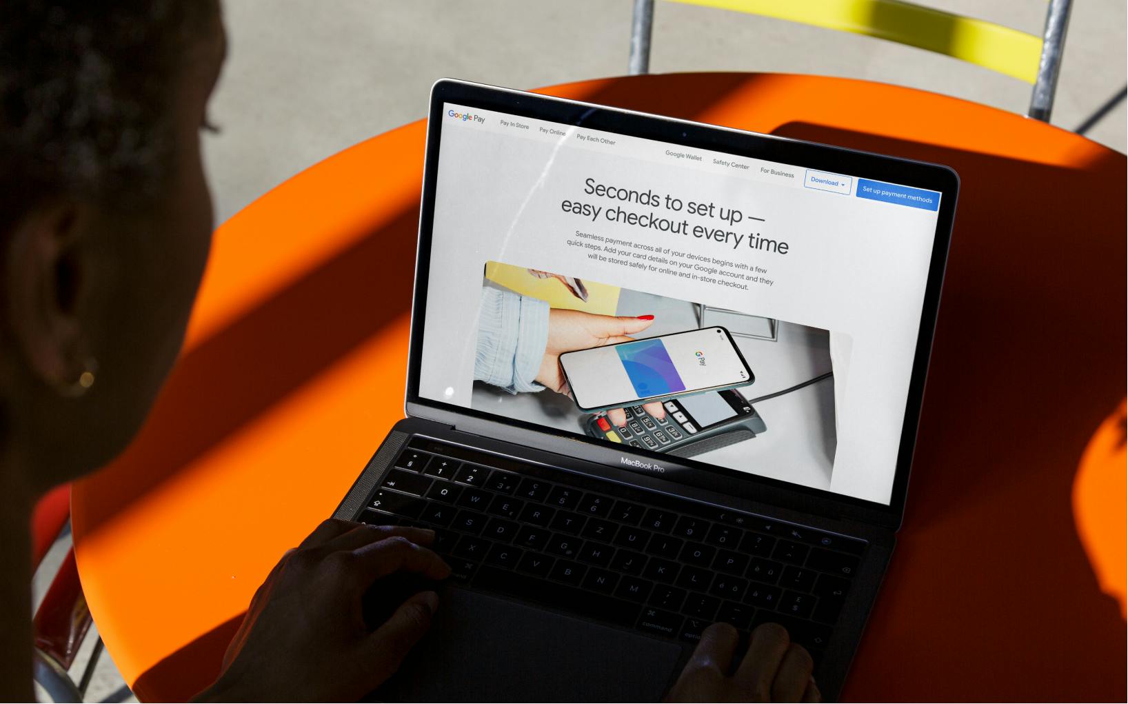
Designing with Google: Crafting User-Centric Payment Websites
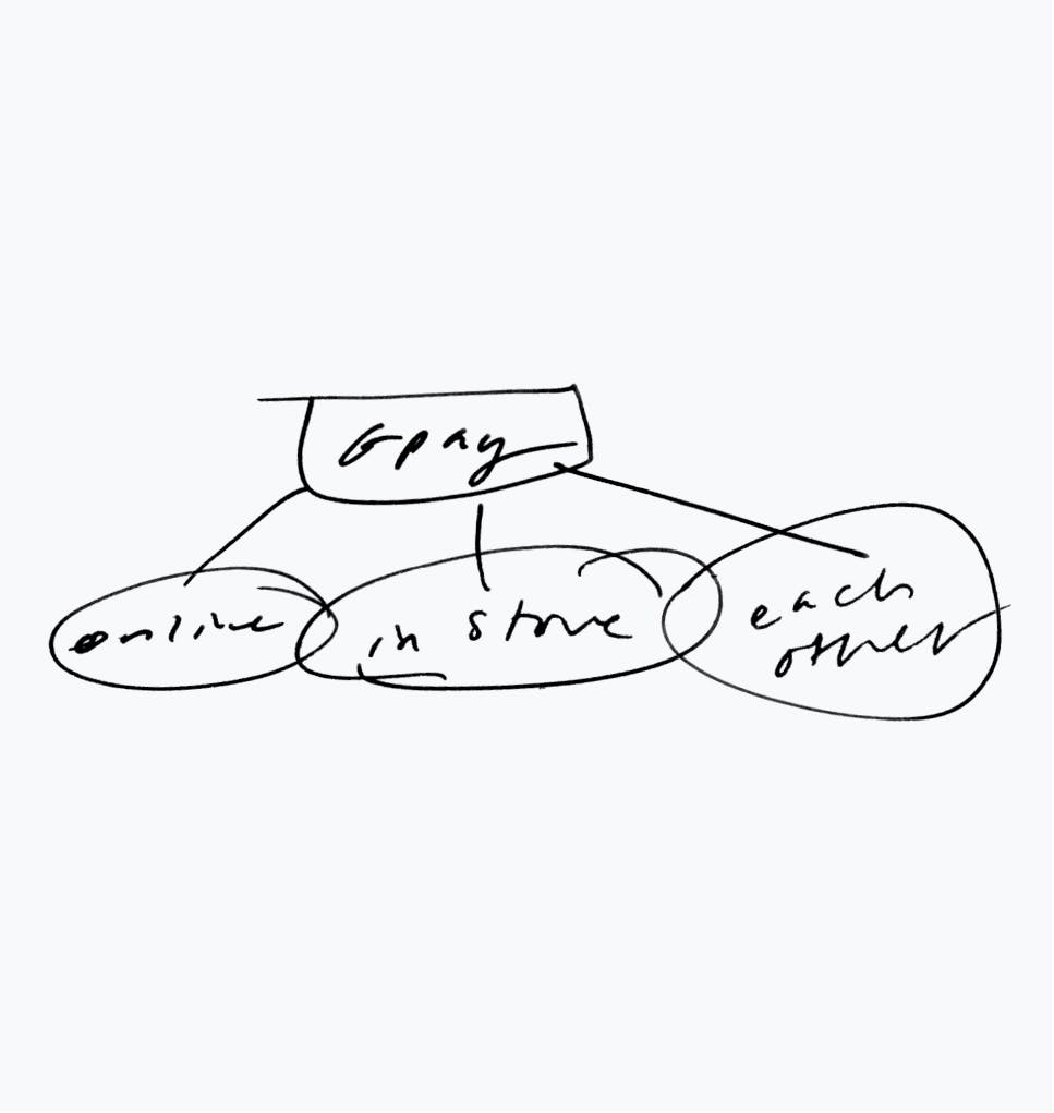
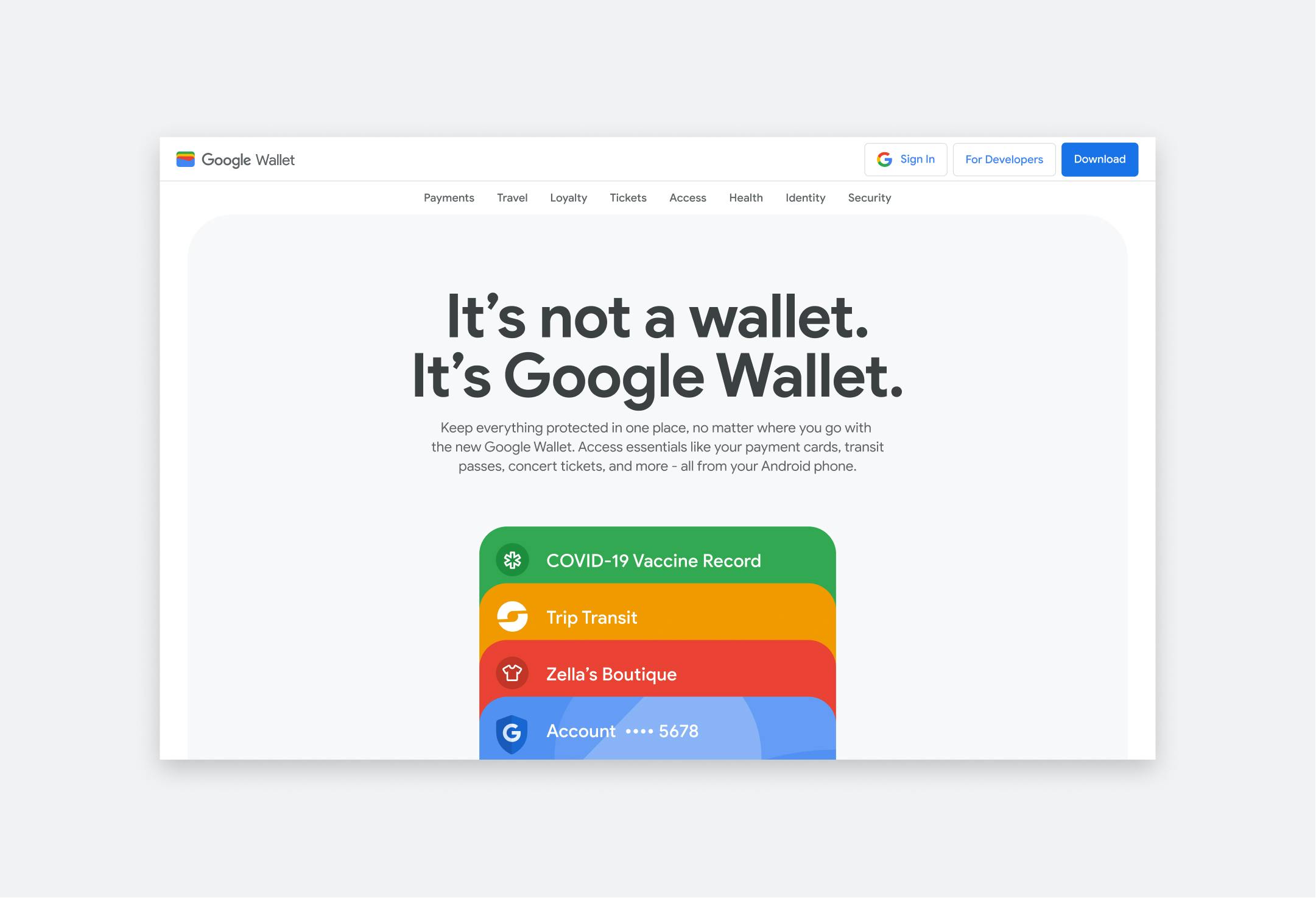
Over 30+ months, our Google payments ecosystem engagement encompassed discovery, concept and narrative building, sitemapping, wireframing, interaction design, prototyping, animation and development—all leading to the launch of the Google Wallet website in 2022 and the Google Pay website in 2023.
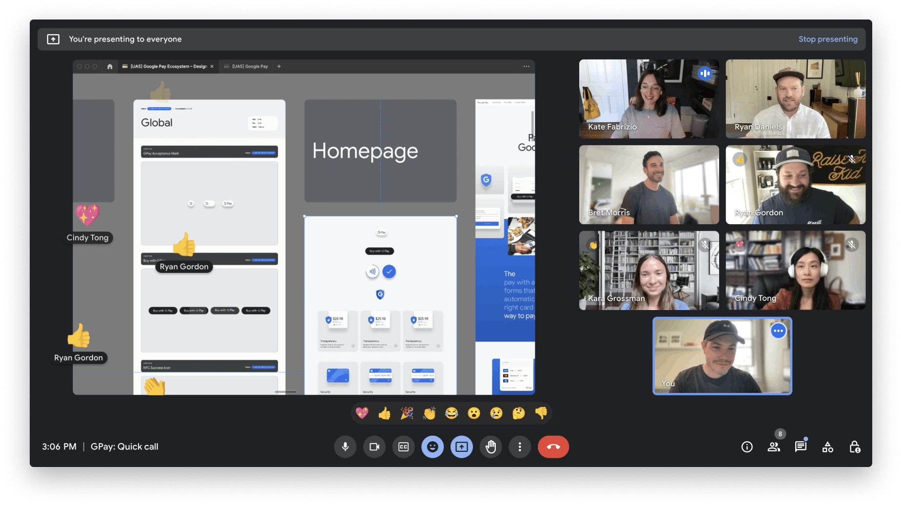
We endeavored from the start to be prepared for rolling sprints in pretty short intervals, so for many of us, Google Pay has been a regular weekly fixture over three different fiscal years. In that time, we’ve become incredibly close with the Google team, communicating with them in the same ways we would with our own team members.
Beginning with thematic exploration, we tackled all existing research and briefs, adding in intuition as user experience experts to derive numerous storytelling approaches to both websites. Lifestyle, abstract UI, color, slice of life moments and more eventually melded into design and copy inspiration. Each site needed to make the magic of the ecosystem apparent and the concrete functionalities clear.

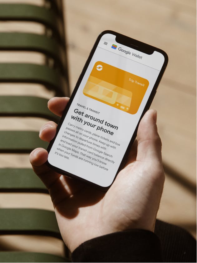
The first website up was Google Wallet, which took the form of a slice of life narrative woven together with abstract UI. Imagine using only your phone to pull together a super successful day involving taking the subway with a tap, paying a friend back for lunch, getting rewards at your favorite store without having to plan it, then getting through the doors of a venue for a concert by showing your ticket, ID and vaccination card.
Through many iterations and many tight turnarounds, we workshopped design and copy in sprints and in real-time, flexing to reviews and new feedback quickly and excitedly. When it came time to hand off to another development team, we availed ourselves and stayed in the fray, troubleshooting and revising as code dictated changes.
We’ve become incredibly close with the Google team, communicating with them in the same ways we would with our own team members.
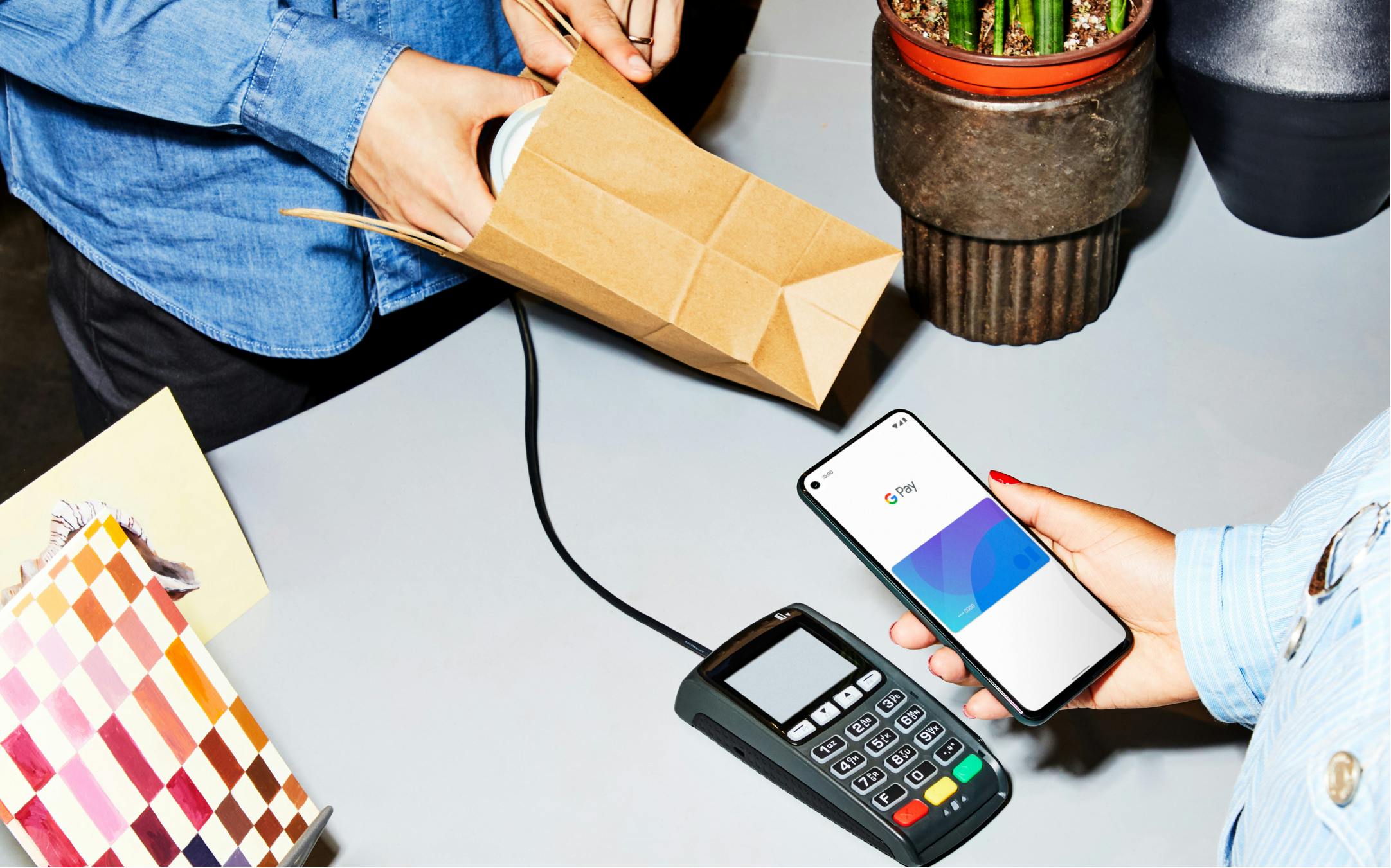
That GPay sticker you see in the window of millions of stores across the country?
That’s Google Pay; and it means that you can tap to pay with Google Wallet using only your phone.
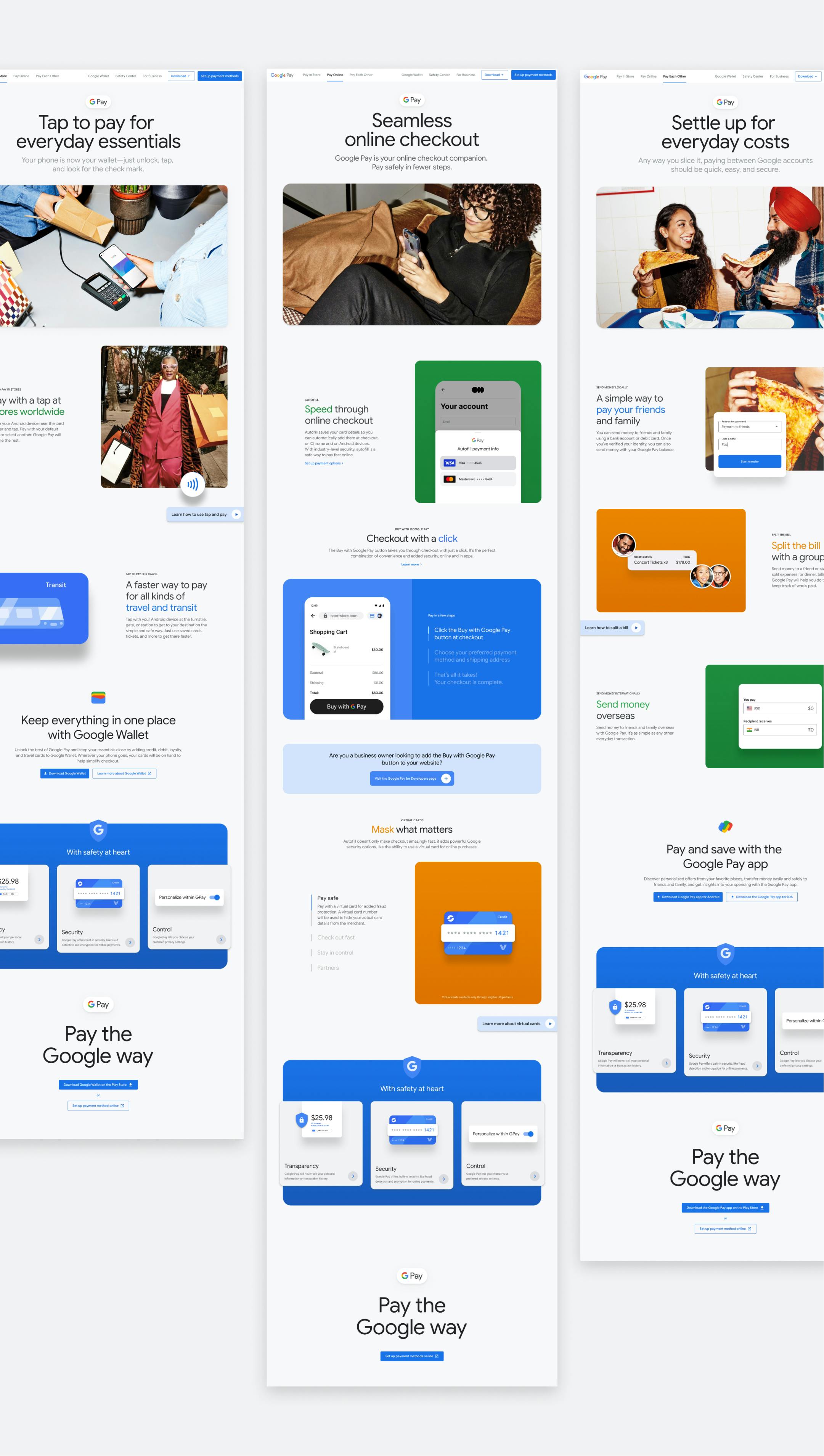
Next up was the larger, more nuanced Google Pay site, which we kicked off with tons of additional background and product knowledge, having just completed the Wallet site. As a result of our successful partnership on the Wallet site, we were tapped to bring the Google Pay site to the finish line autonomously, from foundational strategy to development and launch.
Design, strategy and copy worked hand-in-hand for nearly a year, fine tuning the story and the content as new feedback came in and product features evolved or launch dates of specific functionalities changed. We’re always searching for ways to distill what makes a Google product special into a digestible essence. In the case of Google Pay, we were still searching for a way to say and show the idea of ‘paying across Google.’
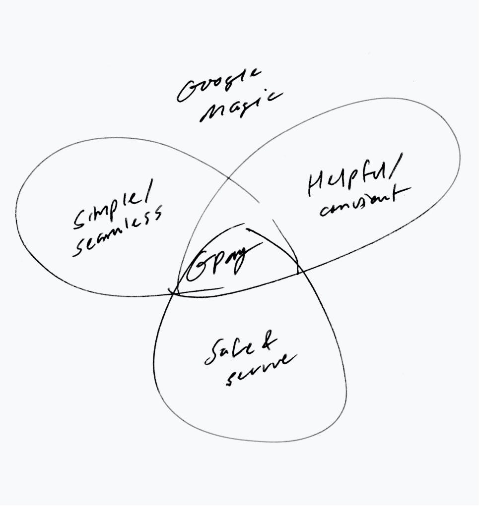
Paying across Google essentially means that when your Google Account is connected to other Google and third-party apps, deeper and richer features are unlocked, and things run smoothly. The point of technology is to free up our minds to do more important things, right? After many iterations, we came up with ‘Make checkout magic’ as a visual and messaging theme, and we began to build the site around this phrase.
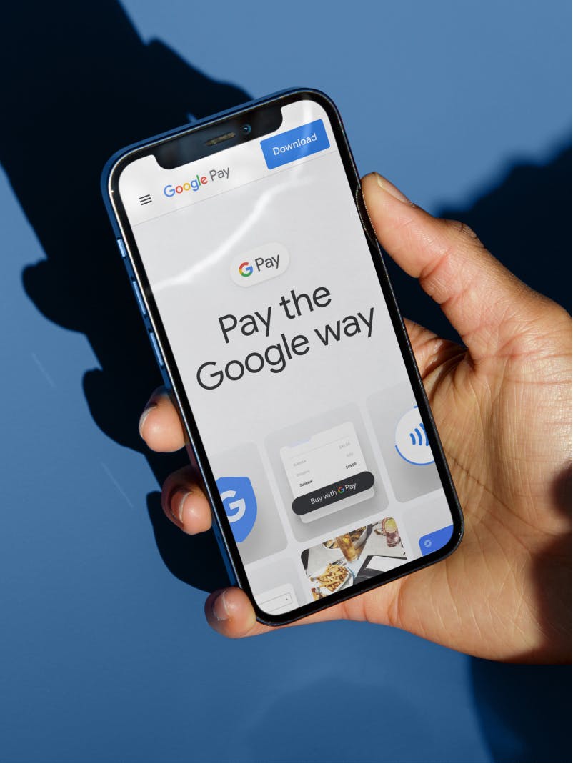
Over months, we kept returning to an alternate phrasing from earlier in the engagement, and eventually ‘Make checkout magic’ became ‘Pay the Google Way.’ Both hint at the same thing: when Google is by your side, everyday actions and transactions happen effortlessly in an intricate, interconnected sequence that removes obstacles and, hopefully, adds some happy to an otherwise frustrating and friction-filled experience.

From there, we worked on punching up the story and the visual universe, from homepage to the multiple child pages. Our developers got involved early to advise on feasibility and forewarn the design team of any watchouts. Because of that, we managed to avoid many of the hiccups that come with handing off development to another agency.
After under a year, we were able to launch this gigantic experience, knowing that we had been exceptional partners at every step.
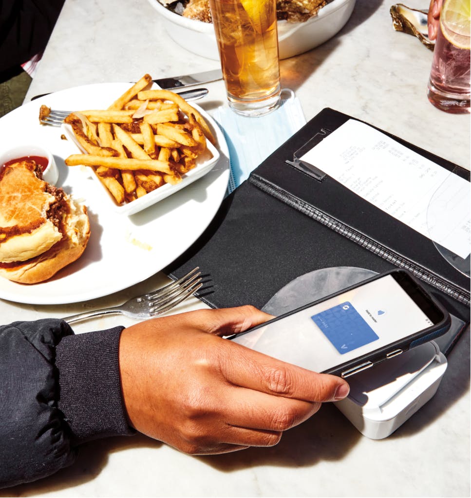
Our Impact on Google Pay: A Story of Tech, Design, and Success
The Google Payments ecosystem has Use All Five’s fingerprints all over it, and the two sites we launched in this period are major testaments to the fruitful and high-functioning collaboration between our team and the Google team.
Consumer confusion around Wallet and Pay as separate but connected entities should be assuaged, and it took storytelling, relatable moments, user interfaces in understandable context, exciting on-brand design, smooth and beautiful animations and an incredible ability from our development team to translate all of the visual and written elements of this project into living, breathing code.
If you’re an Android user, you need the Google Wallet app yesterday. Everyone else should make sure that their cards and accounts are connected in Chrome. Shopping, exchanging money between friends, settling up for rent, riding the subway, sending money abroad, checking out online (and about a million other things) have never been so easy.
We have a good feeling that our collaborations with this team at Google have just begun.
“Use All Five are incredible partners and people. They’re always on-hand with expert advice and solutions. Even when the ask is complex and the turnaround is immediate, I know they'll come through. We love working with them.”

