The team at Use All Five is driven by a passion for diving deep into the past in order to shape the future. In an era defined by rapid technological advancements, connecting across generations is more vital than ever. Museums, often seen as the keepers of history, are evolving to embrace the digital age. At Use All Five, we've been honored to have the opportunity to craft educational websites for museums over the past several years, helping connect audiences around the world with educational content when physical access has been limited. And we’ve learned a few things along the way.

The Digital Canvas: Crafting Educational Museum Websites
Museums are no longer confined to physical walls. After COVID disrupted educational norms, museum websites are now expected to serve as dynamic canvases, enabling institutions to extend their reach beyond the limitations of time and space. The websites that we’ve redesigned for museums like the New-York Historical Society and the Kemper Museum of Contemporary Art are able to draw digital users into the physical world, connecting pieces of history with eager users from far-away places.
To successfully translate the feeling of an in-person museum visit to an online experience, we begin by working closely with our stakeholders to understand the values of the organization. Key stakeholder interviews are crucial for building museum websites, as many departments in organizations like these need their content to be accessible, magnetic, and immersive. There’s often an information hierarchy problem to solve as well; many museums’ knowledge bases and collections may span multiple centuries, industries, and mediums.
We also believe strongly in user testing when it comes to educational content online. This is especially true for museums. Without a docent or guide to walk you through the museum, the user experience needs to be intuitive enough for people to explore at home on their own. At Use All Five we always test the sitemap and top-level navigation in addition to any sticking points throughout the design process. This ensures we end up with a website that the museum can be proud of aesthetically and that their audience wants to keep coming back to.

Understanding the Generational Divide
Museums are no longer just places where your Grandma drags you when you have the day off of school. With the advancement of technology, museums and their websites can be engaging and educational for all.
We specialize in architecting and designing curricular microsites for the New-York Historical Society’s various educational initiatives and exhibitions. For these microsites, like the Citizenship Project and Acts of Faith: Religion and the American West, we aim to present the information in an easily readable format so that teachers, students, and users of all ages can access the information easily and engage with the content productively. We work collaboratively with the curriculum writing team to craft a design that works across generations and user personas.
Tailoring Content for Each Generation
From interactive exhibits to virtual tours, tailoring content to cater to the preferences of various user groups is crucial.
For the Citizenship Project, we knew that audiences would be first generation Americans, therefore the site needed to be fully localized into Spanish. Within that same website, we made flash cards for a younger audience and more detailed reading materials for our older generations.
On the Meet the Presidents website, the New-York Historical Society team developed an animated short video series for our younger, video-savvy folks. There’s even a game, developed by New-York Historical Society’s own Teen group!
On both of these websites we used a mixture of text-heavy content and interactive mediums to make sure every type of user could learn in their own way. Understanding the technological comfort levels and expectations of different generations empowers us to create seamless and enjoyable learning experiences.
The Art of User-Friendly Design
Navigating Through Time
User-friendly design is the cornerstone of any successful educational website. Implementing intuitive navigation, responsive layouts, and accessible content ensures that users of all ages can seamlessly navigate through digital exhibits. A well-designed website becomes a tool for exploration and discovery across generations.
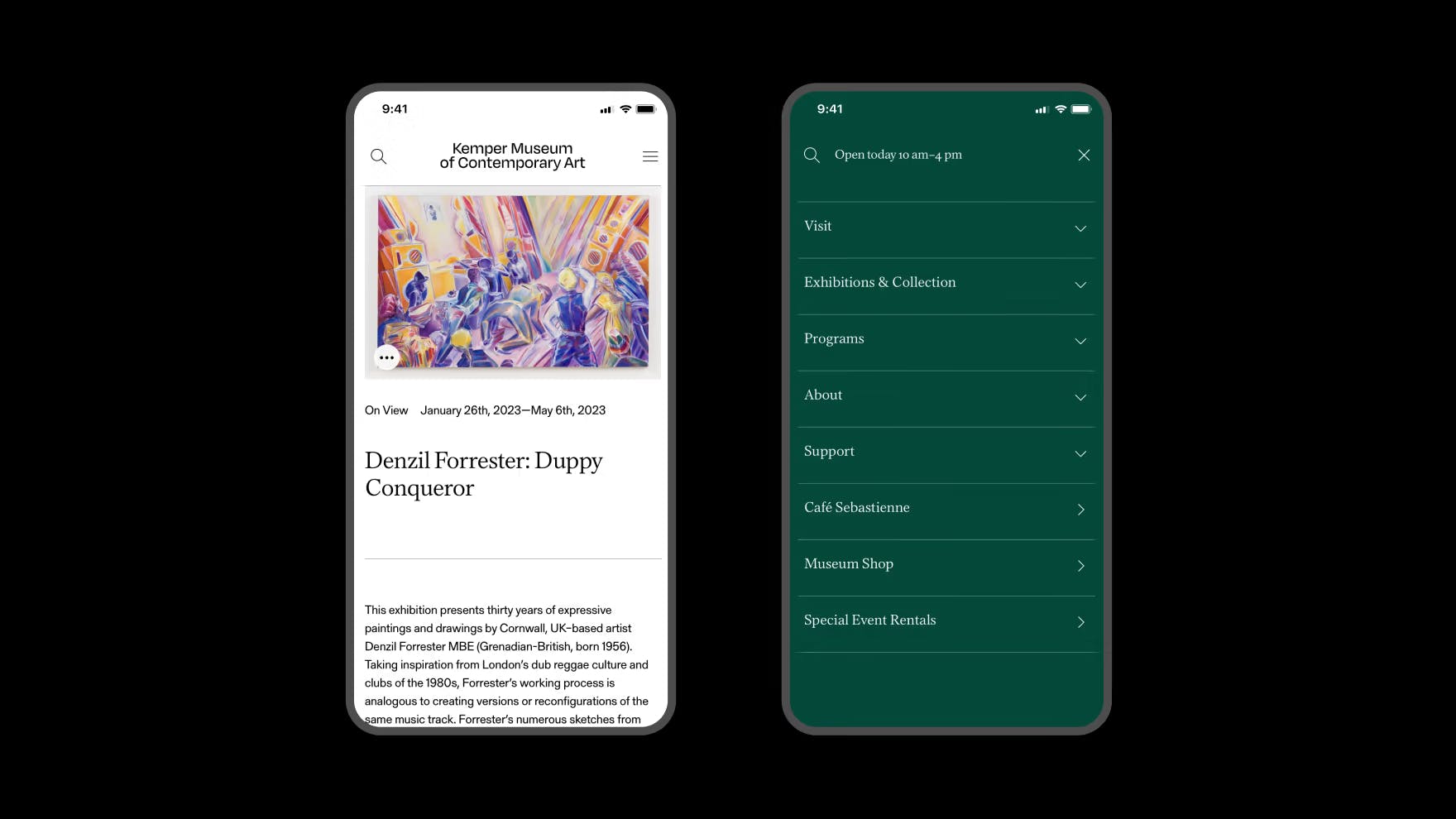
One of the design priorities for the Kemper Museum of Contemporary Art was to feature its permanent collection of artworks prominently, so that users could search and filter through the works and the artist's biographical details easily. We worked closely with the Kemper team to find an interface to display all 1,300 works of art in an aesthetically pleasing way that felt like an actual visit to the museum. Using our UX best practices and ADA knowledge, we made sure this section of the website was intuitive and user-friendly in addition to beautiful.
The design system that we created for Guggenheim ensures readability and usability. For over a year, we partnered with Guggenheim's tech team and brand managers to look at the website from a macro viewpoint and rethink how users could navigate the online world of the Guggenheim. We standardized blocks, text, buttons, and navigation, making it easier than ever to experience the Guggenheim from home.
Visual Appeal and Engagement
Captivating visuals are key to holding the attention of diverse audiences. Incorporating multimedia elements, such as videos and interactive quizzes, enhances the overall learning experience. Striking a balance between aesthetics and functionality is often the key to creating an engaging educational platform.
For the New-York Historical Society website, we work on adding new formats as trends and user behaviors change. We developed an interactive quiz module for them, riffing off of their successful ‘Daily History Facts’ social posts. This module can now be used anywhere across the site without development support.
We also incorporated a video library for their educational microsites, as long form content has become more important than ever. These video libraries are customizable and easy to use, again allowing the New-York Historical Society team to expand their content and reach in perpetuity.

The Role of Technology in Intergenerational Learning
Embracing Technological Innovation
Technology is the bridge that spans the generational gap. Augmented reality (AR), virtual reality (VR), and interactive simulations bring historical artifacts to life, captivating audiences young and old. Embracing these innovations allows museums to stay relevant and create a truly immersive educational experience.
At the New-York Historical Society physical space, there is an accurate replica of the Oval Office for visitors to enjoy. Museum-goers can even sit at the desk and pretend to be the President! So, when we designed and developed the Meet the Presidents Curriculum Guide, we knew we needed to use technology to our advantage to make this experience feel as special as visiting the museum.
We built a 3D virtual tour of the Oval Office using Matterport, inviting users inside of the exhibit. We layered on hot spots with information about the Oval Office so that at-home users could immerse themselves as fully as those in the museum. The only difference from the IRL experience is that you can’t put your body in the virtual tour... At least not yet!
Conclusion
Educational websites for museums are powerful tools that transcend generational boundaries, fostering a shared understanding of our collective history. By embracing technology, user-friendly design, and intergenerational learning strategies, museums can build bridges that connect the past, present, and future.
As we navigate the digital age, the evolution of these educational platforms ensures that the treasures of our history–whether priceless works of art or documents from the 1600s–remain accessible to all, creating a legacy of continuous learning for generations to come. Use All Five is proud to be at the forefront of translating these physical experiences to digital ones, and to add joy and interactivity to the process of engaging with crucial cultural content.


