We’ve been enjoying your recently released Archive of Collected Ephemera & Printed Material. It made us wonder about what other images you collect and identify with. What’s your current background image on your phone? Tell us a little about this image.
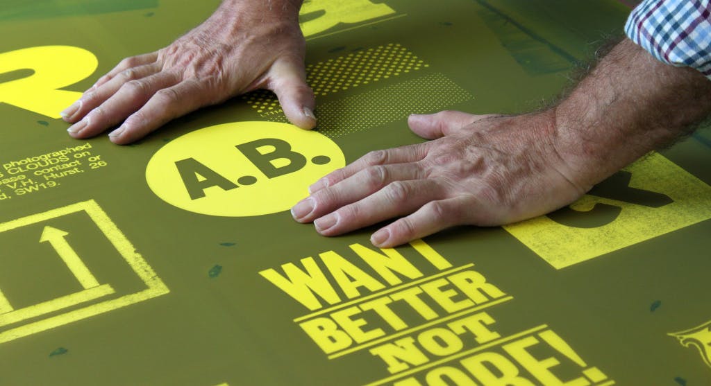
The current background image on my phone is a shot of some beautiful wood type I took at Adams of Rye. I print all my letterpress work at Adams; it’s my local printer and has a huge collection of wood and metal type. I appreciate the physicality of the wood letters. I like the contrast between the lo-tech wood type and the hi-tech phone. It sums up my approach to analogue and digital–I think there is a place for both. I work a lot using analogue means which are then circulated using digital devices.

Since you work with a mix of analog and digital tools, are there any lessons from working with letterpress (and other analog processes) that you think could benefit digitally-based designers? And vice versa?
I’ve always worked on the boundaries between disciplines. My art education was a mixture of graphic design, illustration, printmaking, and fine art. It’s something I’ve continued in my practice as a designer. I like to explore as much as I can, seeking out forgotten techniques and looking beyond the obvious. I’m keen to produce work that has a strong personality and singular message. It makes a nice change to move between different disciplines; it re-energises and keeps things interesting. As designers, we should be constantly exploring new areas, going off at tangents and trying out new things. I’ve always had a singular vision–it’s my visual handwriting–but I’ve managed to try out lots of different ways of making work that help keep everything moving forward. Whenever I feel like things are getting a bit flat or losing energy, I switch to a different medium to freshen things up. I’ve worked on a huge variety of projects, but always had the same approach: to communicate and engage with the audience.
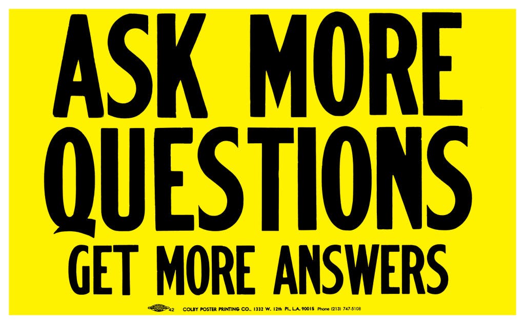
Your posters have a large following; they’re uplifting and address viewers directly. When someone reads ‘Don’t Say Nothing’ or ‘Ask More Questions’, they feel like they are the ones being spoken to. When you create these messages, who is the speaker and audience you have in mind? Does it ever change? Has the popularity (and occasionally, the mimicry!) of your designs affected the messaging in your work?
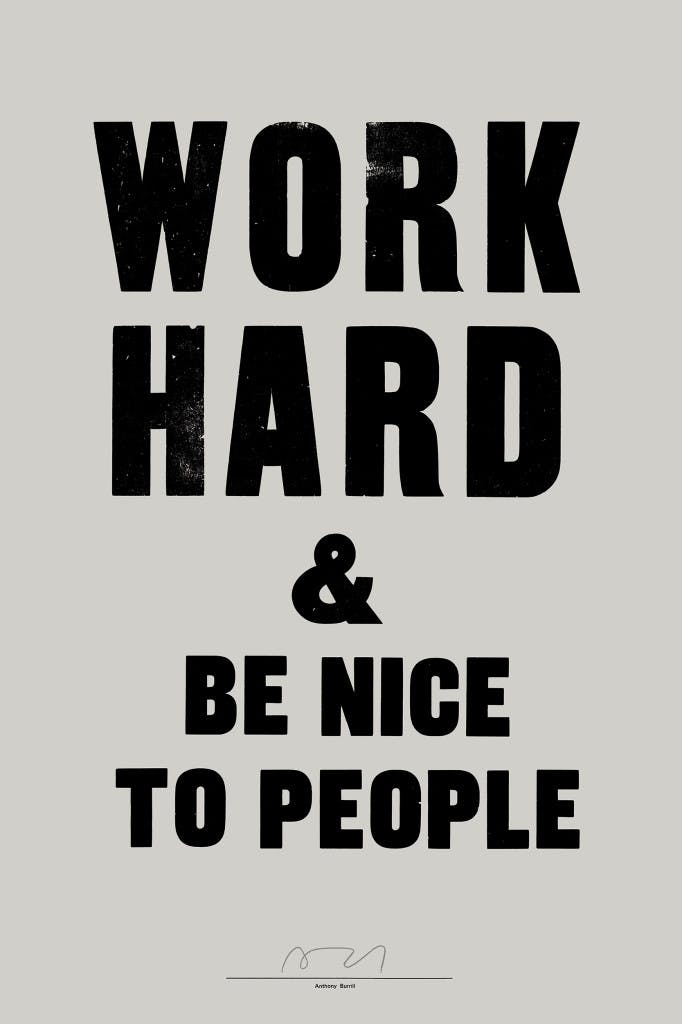
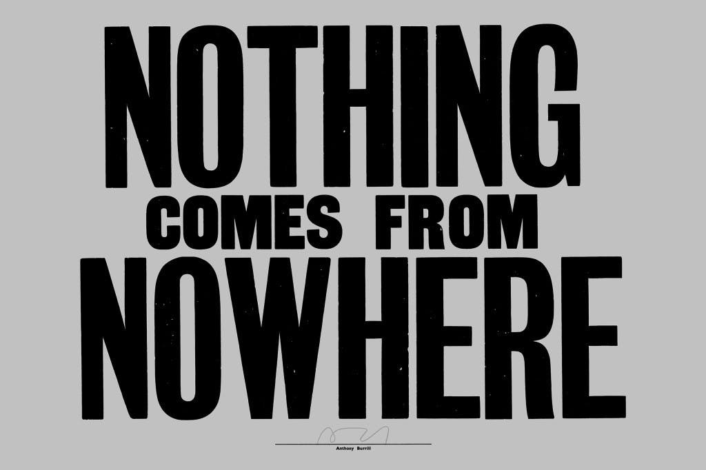
Each poster is a singular comment or observation. They have developed into a body of work that has become recognised. I never set out to do this. It happened as the work progressed and gained an audience. It started with ‘WORK HARD & BE NICE TO PEOPLE,’ which I first made in 2004. The intention with that piece was to make a small gift for friends and something that I could send to clients as a piece of self-promotion. I began to get requests for copies, so I printed some more, eventually selling it from my site and through a few small independent shops and galleries. I never imagined I’d still be producing it and talking about it over ten years later. You never know how your work is going to be received. I’m still amazed by the popularity of the piece. I keep the messaging consistent; it’s part of the intention to spread positive messages and make people think. There’s enough negativity in the world. My work is intended as a positive antidote. I think long and hard about the text I use; it’s hard to avoid cliche and cheesy phrases that look like they should be in a greetings card. That’s part of the challenge of working with such limited means–all I have are the words and some simple typography to convey my message.
Most people these days can rally behind the sentiment of ‘simple is best.’ Your work is magnificently simple in composition and message. Is simplicity always preferable to complexity? When do you appreciate complexity?
I like to keep things simple in both my life and work. When things are simple, there is less to go wrong. I try to avoid chaos and uncertainty. But sometimes it’s hard to avoid, and when it’s unavoidable, it’s good to embrace it. I’m pretty steady in my day-to-day life. I approach things with the minimum of fuss. I think long and hard about the decisions I make, I try to get to the heart of whatever it is I’m doing, and I see things through with attention to detail. At the same time, I embrace chance elements and look out for happy accidents; it’s important to have balance in everything, and not to try to control every aspect of your life and work too much. I like to throw myself into new experiences. I still like the feeling of slightly getting lost for time to time; it helps clear out the temptation to overthink things too much.
Posters circulate in an array of spaces, ranging from city streets, to bedrooms, to Tumblr feeds, and more. In addition to these spaces, your posters also live in (or are made for) galleries and exhibitions. How does the location and audience inform the messaging in your poster design? Does your process differ when creating posters for specific environments?
My work always has the same intention and tone of voice. Whether I’m making a work for a gallery or to be posted in the street, I approach it in the same away. Everything I do is about communication. You should be able to tell your story in whatever medium is at hand. My audience is everyone; I try to make work that isn’t specific to one group or have particular cultural references. I look for broad truths that can be related to by everybody from whatever background.
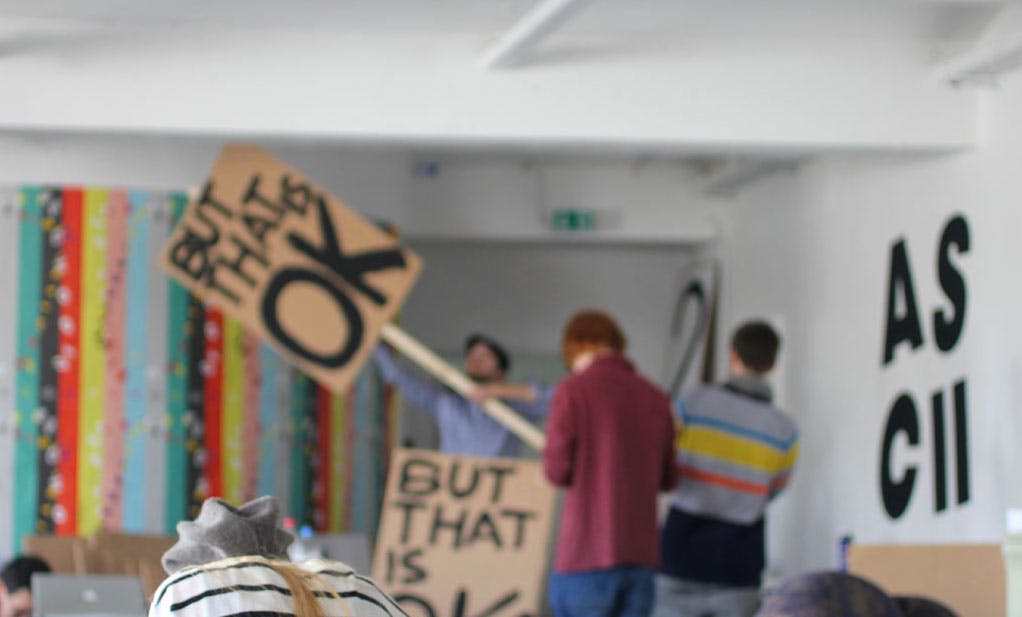
There seems to be a sense of activist vernacular in your poster design. You conducted a workshop at the After School Club in Offenbach Germany in 2013, instructing the participants to make a handheld sign, which is essentially a poster attached to a stick. How does someone holding a poster on a stick change the message, compared with a poster on a wall?
When a sign is physically held by an individual, there is a strong sense of conversation, that the person holding the sign is speaking directly to you. That conversation can be direct and honest or subverted in some way; it depends on the context and words being used. I like work that is direct in one sense but that also plays with language and messages. I like to convey a sense of wit and engagement. I don’t like work that is opaque or too layered in meaning; I feel like it has failed if it is intentionally obtuse.
Did you always have such a strong aesthetic voice in your work?
There are obvious parallels with the work I made as a student and my current output; I’ve always been fascinated by communicating using minimal means. As my work has developed over the years (I graduated in 1991 from the Royal College of Art in London) it has become much better at communicating with people and conveying a message. All the elements of my later work were in place when I was a student. They just needed ordering and editing to get the message across properly. I was striving for something with my student work, but never really got there. Only later did I figure out what I was about. There’s always a temptation to try to form your ideas too quickly when you are a student. We should allow ourselves time to develop and grow. Learning doesn’t stop when you leave college; in may ways that’s the time when you really start learning about how you fit in to the world.
Do you have any advice for designers on how to get there?
The simple answer is to stay focussed, care about what you are doing, and enjoy the process of learning. Nothing beats hard work. You have to put the effort in and be consistent. Follow the flow of your work. Let it take you in different directions. Try things out. Don’t be disheartened by failure or rejection. Keep the momentum going and approach everything with energy and enthusiasm.
